6 Tips for Great Nonprofit Graphic Design
My family and I have been raising Nigerian Dwarf dairy goats for over three years, and our journey has been full of creativity, trial, and a little chaos. Much like when I first started Nonprofit Graphic Design, we have learned a lot along the way. When we first started, the goats lived in an old camper that we converted into a makeshift shed. Over time, what was once a detached garage slowly became our barn. It has taken a lot of work, and teamwork, but it is now a space where everything has a place and every routine has a purpose.
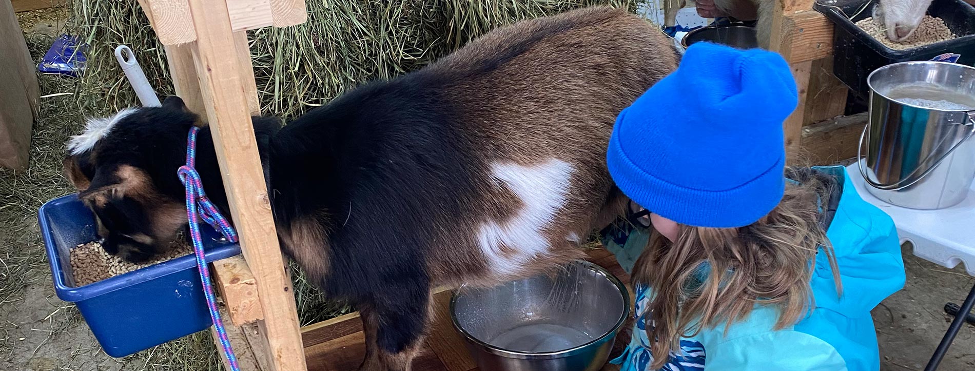
Taking care of the goats, milking them, and keeping the barn running smoothly takes time and effort every day. Over the past year, our family has found ways to simplify the process, improve milk production and sanitation, and most importantly, save time. Small adjustments, like magnets to hold feed scoops or making sure there is a milking stand for each person in the family, have made a huge difference.
Our daughters help with chores, milking goats, filling feeders, and collecting eggs while my wife and I are right along with them. Life on the farm is demanding, but it is also deeply rewarding. The routines we have built, the systems we have put in place, and the teamwork we practice every day make our work more efficient, more enjoyable, and ultimately more successful.
Just as creating order and systems on the farm makes daily chores easier and more productive, order and structure in nonprofit graphic design are essential for fundraising success. Thoughtful design helps supporters understand your message, take action, and support your mission without confusion or frustration.Good

Our first two goats, Little Swan and Little Bear (named after the goats in Heidi) in their goat camper.
From the Barn to the Boardroom
Nonprofit graphic design is often misunderstood. Good design does not mean flashy graphics or trendy layouts. It means design that works. Design that communicates clearly, builds trust, and raises funds.
Some of the most effective fundraising emails, landing pages, and donation forms would never be described as beautiful. They succeed because they remove friction, focus attention, and make it easy for donors to act. Results matter more than aesthetics in nonprofit graphic design.
Practical Design Tips That Improve Fundraising Results
Start with the ask Do not make donors guess why you are reaching out. Lead with the purpose of your message. If you are asking for a donation, say so clearly and early. Respect your donors’ time and attention.
Focus on one action Avoid multiple asks in the same email or page. Too many choices confuse donors and hurt results. One message should lead to one clear action.
Use readable fonts and sizes Design for real people, including older donors. Text should be easy to read without zooming or strain. Simple fonts and generous font sizes improve comprehension and response rates.
Use white space intentionally Crowded layouts feel overwhelming. White space helps guide the eye and gives important content room to stand out. A clean layout communicates confidence and clarity.
Design for scanning, not reading Most people skim. Use clear headings, short paragraphs, and bullet points. A donor should understand what you want and why it matters within seconds.
Prioritize function over appearance If a design converts and raises funds, it is successful. Even if it is not visually impressive by design standards, clarity and effectiveness always win.
Consistency Builds Trust
Just as our family relies on consistent routines to keep the farm running smoothly, consistent design builds trust with donors. When your website, emails, social media, and printed materials feel cohesive, supporters are more likely to see your organization as reliable and capable. Trust is built through repetition and clarity.
Make Every Effort Count
Nonprofits rarely have the luxury of unlimited time or budget. Good nonprofit graphic design ensures that every email, campaign, and appeal works harder. It reduces confusion, improves engagement, and increases the likelihood that supporters will follow through.
Conclusion
Effective nonprofit graphic design is practical, intentional, and results-driven. It creates order, removes obstacles, and helps donors understand how they can help. Just as small systems and thoughtful improvements have transformed the way our family cares for our animals, clear and purposeful design can transform fundraising outcomes. When design is focused on clarity and function, your mission becomes easier to support and far more likely to succeed.
If you are part of a nonprofit and feel like your fundraising materials are working harder than they need to, it may be worth stepping back and looking at the systems behind them. Small, thoughtful changes in design can make a meaningful difference. If you ever want a second set of eyes or a conversation about how your design is supporting your fundraising goals, I am always happy to talk.


Leave A Comment